Case study
02
T-Bike
A cycling storefront that sells a bike on how it rides, not on its spec sheet, then puts the numbers where a buyer can still check them.
- Disciplines
- UX/UIE-commerceArt direction
Overview
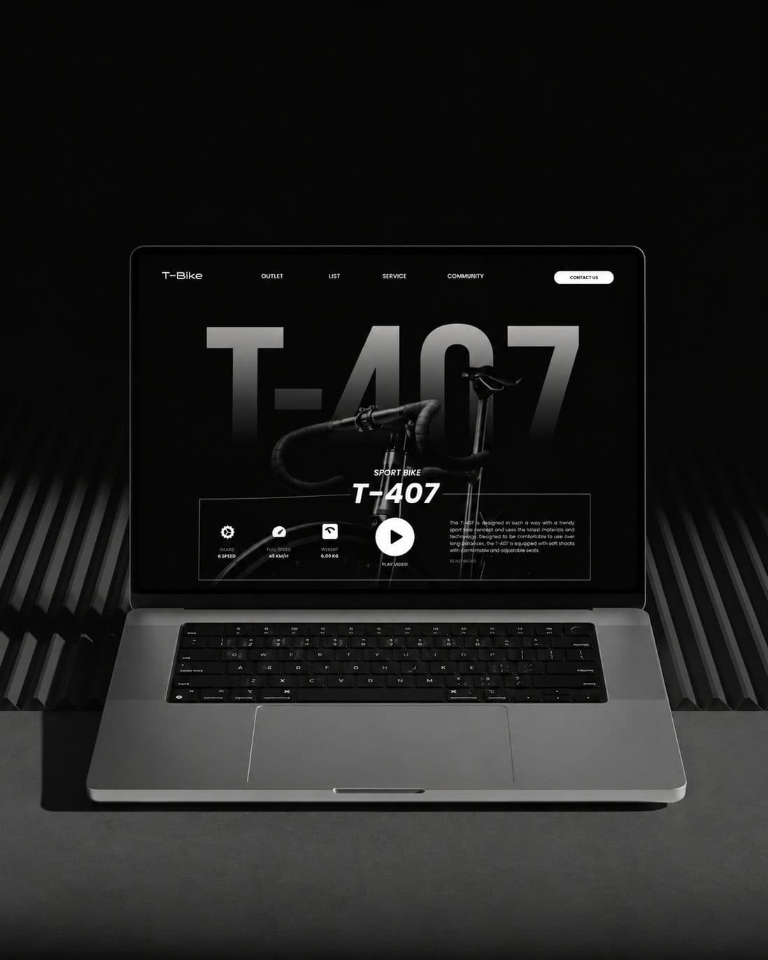
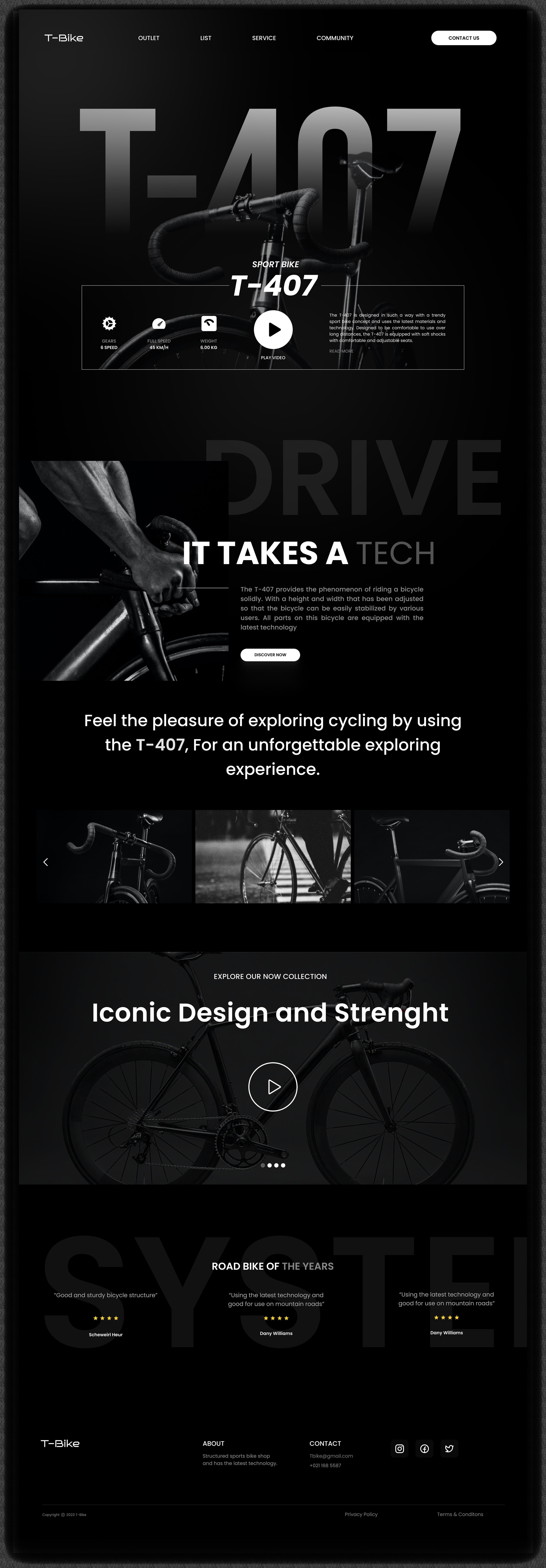
T-Bike is a storefront concept for a performance bicycle brand. The product leads at full bleed, the specification sits directly under it, and the rest of the page builds the case in the order a rider actually asks: how does it ride, what is it made of, who else bought it.
Approach
Bicycle sites tend to lead with specification because specification is what the category argues about. The trouble is that every brand has the same numbers, so the page ends up dense, dated, and identical to its competitors.
T-Bike puts the emotional case first and keeps the technical case one scroll away rather than hidden. That has to work for two readers at once: an enthusiast who came for the geometry, and a first-time buyer who needs to be told why any of it matters.
Results
The brand reads as premium before a single number is quoted. Product discovery is simpler, the technical detail is easier to take in, and the layout holds up as a template for the rest of the range.
Have a challenge that belongs here?
Every project on this page started as a business problem someone needed solved. Tell us yours and we will work out the right direction.